Here are some examples of an inaccessible internet experience. Users going to a search engine site and not being able to find the search bar, or getting to a search results page but not being able to comprehend anything because the information is not in sequential order. These simple tasks would make your life much slower and more challenging to navigate.
In this article, we will help you understand how those with disabilities navigate the internet and provide simple design recommendations that UXers can implement to make the internet more accessible.
Understanding Users with Disabilities
It’s important to remember that designing for accessibility does not mean exclusively designing an experience for those with disabilities. The small differences we implement make a better experience for everyone. We all benefit from better captions, better call to action buttons and more organized content.
Categories to consider when designing for accessibility

Visual Disabilities
Visual disabilities can be categorized as blindness, partial blindness, and any form of color blindness. Some tools they use are screen readers, refreshable braille displays, and a built-in magnifier in a browser.
Hearing Disabilities
Tools used by those with hearing disabilities are video subtitles, audio transcripts, and ASL translators.
Motor Skill Disabilities
Hands-free mouse tracking and voice controls are a few tools used by those with motor disabilities.

Cognitive Disabilities
Examples of those with cognitive disabilities are dyslexia, ADHD, and Autism. Clear, concise information is key to help this audience.
Accessibility for UX Design
At its core, accessibility and UX are one and the same. Designers want to make software and websites easy and reliable for users. But sometimes small design elements are overlooked and unfortunately, this affects those with disabilities the most.
Color Use And Contrast
Sometimes we want elements to be very subtle in design, like the outline of a form field. While this looks great, not everyone can see the subtleness of the outline. Changing a color minimally can drastically improve accessibility.
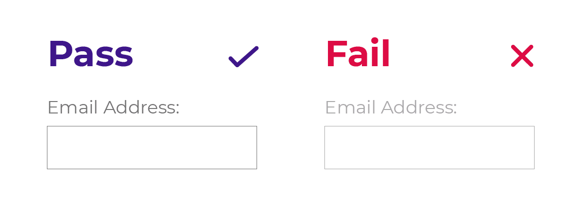
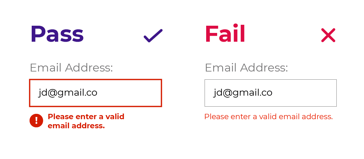
We suggest you check all the colors in your design with WedAim’s contrast checker tool. You can also simulate color blindness with Sim Daltonism, a free software for Apple software.
Webpage Structure
Page structure also plays a large part in accessibility design. Make sure you have proper headlines (h1, h2, h3, h4, h5), bullet-point lists, tables with clear columns/rows and images with alt text. All of these items not only help with organization, but they also allow users to navigate with keyboard shortcuts when a mouse is not an option.
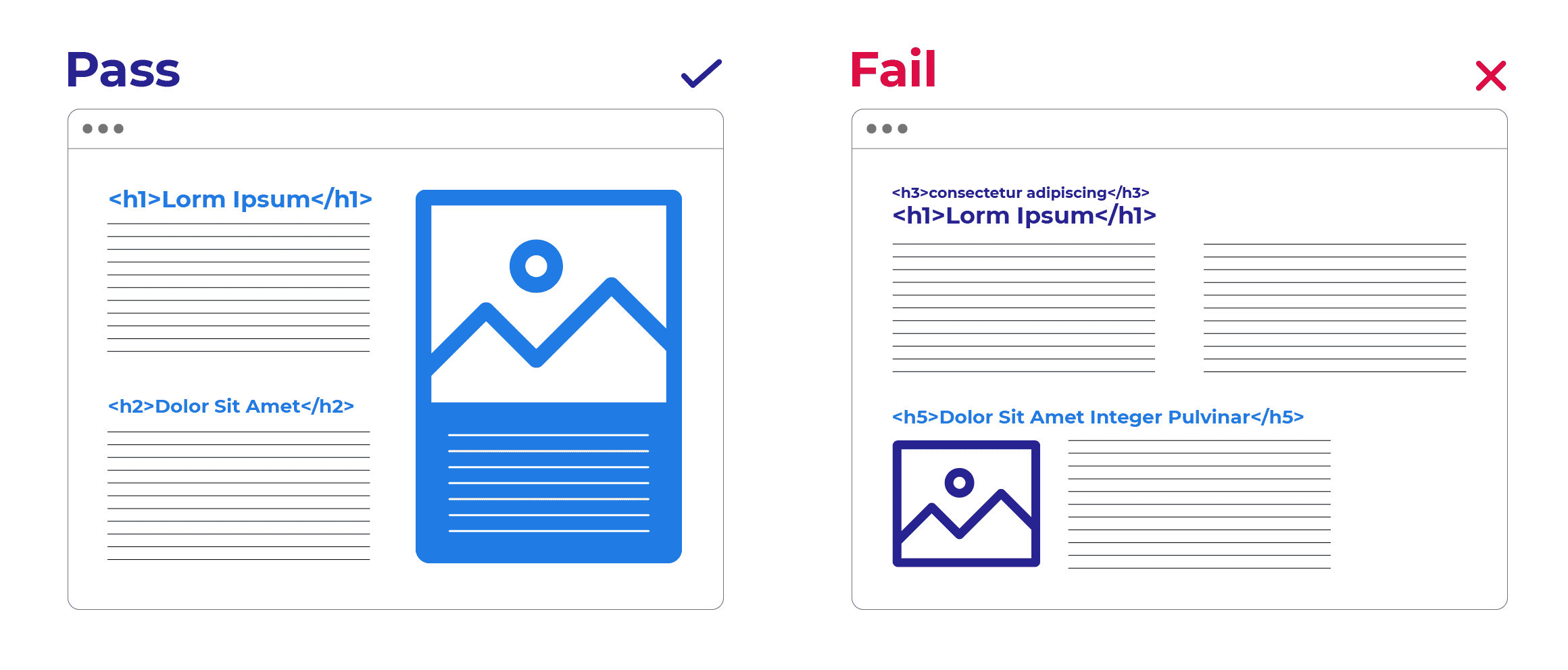
Extra line spacing within paragraphs of text visually helps everyone to comprehend content. Designers love white space, and so do readers.
Links and Buttons
Web designers often want a short and simple call to action such as “Read more” or ”Get discount”. While this wording looks great, it leaves some users with many questions when there isn’t context around the action. Read more of what? A full article? A section of the web page? Is it an accordion? Is the user leaving the webpage? If we add more context all users can better understand what will happen next.
“Read the entire food article” implies a user will leave the page and go to a full article.
“Get a coupon code to use during checkout.” tells the user exactly what they are getting and when to use it.
Media Transcripts and Captions
Videos and podcasts are awesome, we can all agree on that. They help SEO and give users multiple ways to absorb content. But not everyone can watch a video and not everyone can listen to a podcast. If you have a video, provide subtitles and a transcript. Most platforms like YouTube or Facebook have an automatic transcript available. Make sure to double-check automation subtitles and transcripts for accuracy. The same goes for podcasts, transcripts allow users who have a hearing disability to absorb content they otherwise would not be able to access.
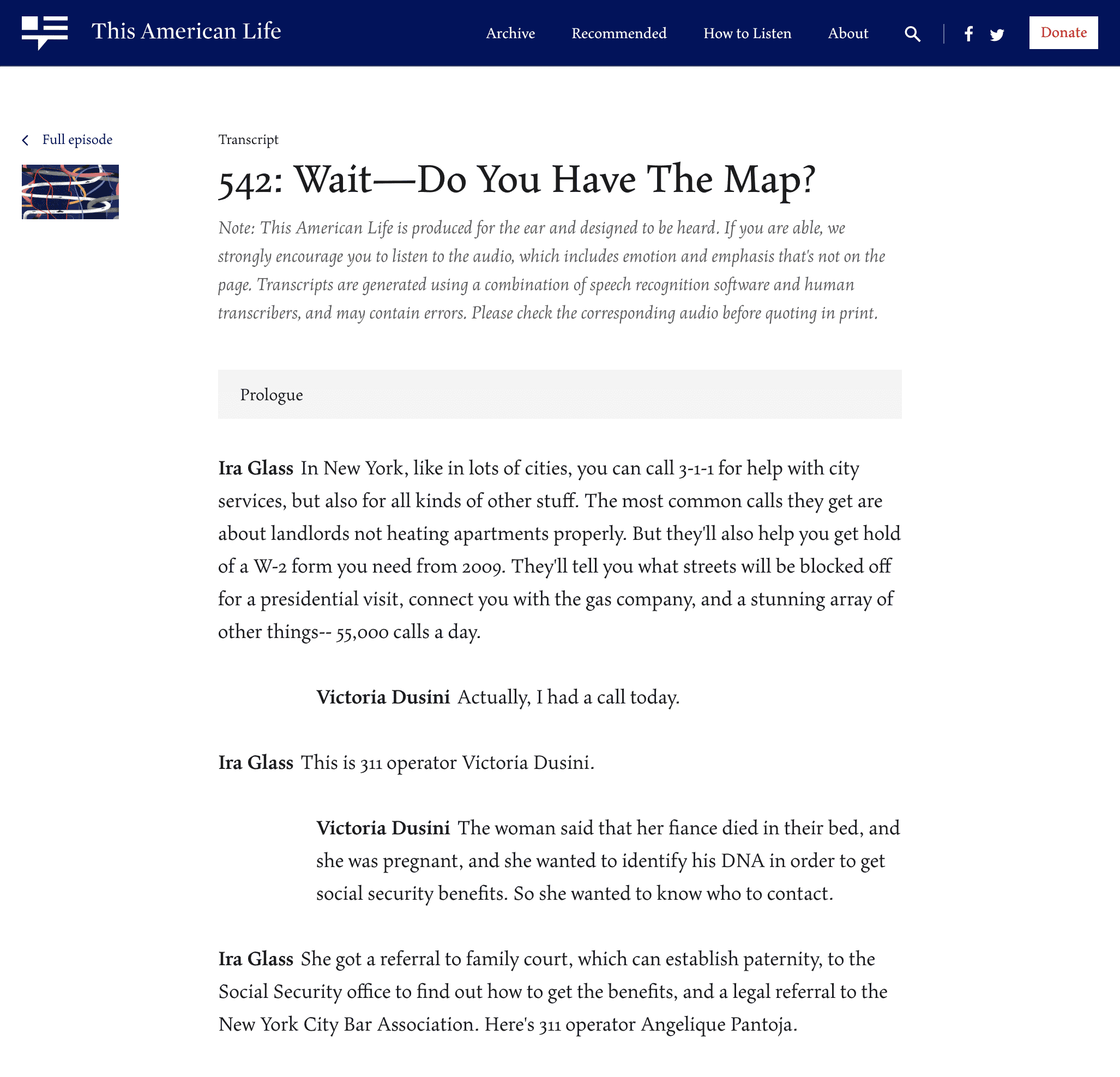
This American Life creates transcripts for all their episodes and visually displays the difference in characters. They also make a note letting users know that audio is available.
Conclusion
Empathy is a large part of our jobs as User Experience Designers and is the core of accessibility design. Being aware of accessibility is the first step to providing a better online experience. Small changes in accessibility design can go a long way for all users. We’re all human and trying to navigate the space around us together.

